
Here's a screen grab and you can see the live map here.
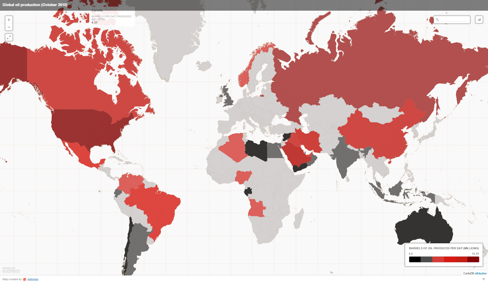
Nice to see data represented as a percentage to allow proper comparison across the map but the classification scheme and colours used in the classification scheme have me a little bothered.

Here are the questions I ask...
- Why a diverging colour scheme for a single variable with no apparently meaningful critical break value?
- What is the value when the colour scheme breaks from greys to reds?
- Why 2 classes for the greys and 4 for the reds?
- What are the class break values anyway...how has the data been classified?
- If oil conjured images of a 'black liquid', why would you use solid black (implying totality maybe) at the lower end of the classification scheme?
- Why do the reds vary not only in lightness but also in saturation, meaning the don't provide a good sequence in visual terms?
- Why is it on Web Mercator when a choropleth really should be on an equal area projection?
- Why, oh why, if you use greys in the colour scheme do you then use light grey to denote NO DATA (which places it somewhere in the middle of the classification)?

These and other questions we'll likely never know the answer to...but these are the sort of things that need addressing so the uninitiated reader doesn't fall foul of the tricks their eyes play on them when reading such a map. Misconstruing the message is inevitable if such cartographic issues aren't addressed to minimize the limitations of our cognitive systems.